Monday, November 7, 2011

Day 230 - Fantasy Writer Attacked by Moby Dick

Me being devoured by Melville's monster.
(This will make sense by the end.)
So I know that somewhere in the back of your mind over these last few weeks you have been plagued by a constant and nagging need to know what is up with The Galactic Mage release. Being fully aware that the release of my book is the central part of your universe to the exclusion of all other thoughts and perhaps even to the neglect of your children and pets, I have decided to take a break from the crushing weight of reading I have been be-heaped with by my professors—that very “be-heaping” giving evidence to the sort of thing I have been be-reading and that has been be-assigned to me by said be-professor… sigh… and, in so be-taking that be-break, I will bespeak of what is up with my be-book.

This copy will be worth millions
someday.
So, for those that missed the report on my Facebook page, I have actually got my first “proof” copy and have set upon the task of reading it through to make sure it’s all good to go. My dearest wife volunteered to read it first, and so it was she who got to discover all the little things that were missed or messed up.

For starters, my editor gets high praise for, in 533 pages, having missed only 4 typos, three of which came at the very end, at the very highest point of climax, and all very close to one another. I can’t help be believe that these oversights, so close together, were due to her having been riveted to the page and, in the thrall of my genius, incapable of functioning in her role as proofreader and editor extraordinaire.

In addition, and quite outside of editorial control, there were two other issues, one of which is a funky spacing thing in which a line of text has only three words in it, but is spread across one full line like this:

There was a bunch of text in one line and everything was fine blah blah and then
the                                                     dog                                                             peed.
Which is not what the book really says, but this shows you how jacked up it looks.


Not sure what that is all about, but needless to say, I'll have to fix it. I fancy that, knowing my luck, fixing it will cascade into some monstrous problem in which whatever technological side effect (Romulan sabotage) that made this happen will become the proverbial golem in the gears, and I’ll spend the next 15 months ordering proof after proof copy, forced to read and re-read the whole damn thing over and over until I finally get a copy wherein the golem is not lurking on some new page or another. Let us hope I am wrong. Seldom do I hope such things, but there it is.

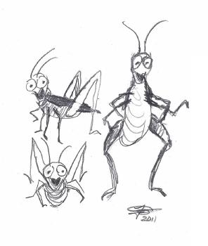
In addition to those problems, I personally made a mistake as well. Now, I know what you are thinking. Right now you sit gaping into your monitor, the downspout of your mouth  pouring saliva into your keyboard as you intone silently in your mind, “No possible way that you made a mistake, John,” but, alas, it is true: I did. Mortal that I am, I forgot to include a graphic.

The Galactic Mage - 8 Schools of Magic
There are 8 schools of magic in my story, and while a graphic that depicts the circular relationship of each to the other is not strictly necessary, I think it goes a long way toward clearing up any possible confusion for readers, especially new-to-fantasy readers who aren’t familiar with the idea of “magic schools” like regular readers of the genre are. So, while not an essential feature, it’s a highly important one if I want to make my story accessible to as many people as possible. And yet, I completely omitted it from the book file. Sigh. Again.

So there you have it, that’s where the book is. My wife just finished reading the proof copy last night, so I’ll be making the corrections to the manuscript today and getting it re-uploaded as soon as possible. Then I can order a new proof copy and start the reading-it-through-again process all over. (And yes, it’s going to get read through every time I have to fix it until it’s as perfect as I can get it. I am going to do everything I can to prevent myself from being one of those people who does not have the pride in workmanship or care for his/her reader to deliver a book in the highest quality possible.)

Beyond that, I have a “book trailer” video underway that I am very excited about. I just saw the first 20 seconds of it yesterday in raw form, and it’s going to be super awesome. In addition, my website is being tweaked this very moment by someone far more qualified than I in order to make it a better commercial venture than I have it set up to be at the moment. And, well, beyond that, I still have a couple hundred pages of Moby Dick to read for this, my last class ever (at least it is if there is a kind and loving God in the universe… or at least some kind of luck that isn't always stupendously horrific and hateful of my personal joy). This class is KILLING ME! I love the books, but not all crammed so close on top of one another. It’s very hard to work, have a family, go to school at night, write books/short stories/blogs/satire, build a website, put together a novel for sale, anticipate and prepare for a new grandchild despite my incredibly youthful and scant quantity of years, AND read books like The House of the Seven Gables or Moby Dick in a two week window, which also includes reading another fifty or so pages of literary criticism on said whale of a novel (please just shoot me in the face if I ever have to do that again after this year) and then write about both book and criticism for class. Bleh. Can’t wait to be done.

That’s where it is. You can thank school for making this novel release take forever and for the precipitous decline in blog post frequency since the semester began (not to mention the over-wrought style of writing you have just waded through—those three of you who managed it—that I am stuck in and too lazy to edit out right now), but, well, only 6 weeks left and I’m done forever. WOOT!

Saturday, September 24, 2011

Day 186 - The Spaceship Has Arrived, But... Lights ON or Lights OFF?

Well, the cover is really close to done (maybe even today!). I have spaceships now, and they are so flippin’ cool. It took a while to hammer out the right look, but Cris Ortega is a master and a professional, and she put up with my picky B.S. and kept at it till she captured just the right look to match my descriptions.  Talk about having to create images from nothing. Cris Ortega has such skill when it comes to bringing out totally original imagery, making real, with little or nothing to refer to or serve as guide, amazingly detailed images that become tangible objects at the tip of her pen. It’s like magic.

You have to think about that for a minute… she has to take my words, which I write down trying to describe what I see in MY head and turn them into images of actual things. Then, she has to send those images back to me and hope that what she created looks like what I saw in MY head. She’s never seen the images or the things they depict. She has to hope I describe them well enough, and that she, who is not a native English speaker, mind you, has interpreted them in the way I hope she interprets them, and then, with all those complications in play, she has to put in  her time to create the image, then send it to me, knowing full well that I might go, “WTF? This isn’t want I wanted at all.”

So, all that said, with incomparable skill, she crafted from thin air, exactly what I wanted. Here’s my (well, Orli’s) ship (light issue aside; I’ll get to that shortly):

The Aspect - From The Galactic Mage

Freaking amazing, yes? I think so. I’m totally stoked.  And here’s the kicker. Check out how this started. This is the first sketch she sent, way back in the beginning of this project when she only had my first crude attempt at trying to describe the ships to guide her.


It’s actually pretty cool, but it doesn’t have the length or feel of the ships in the book.  At that time, we didn’t need to worry too much about it, because that was an initial layout for the whole deal. So, after that initial sketch, we were working on the characters (Orli, Altin and Taot), and then dealing with the sky and castle walls. When we got back to the ship, this next one was the first sketch Cris sent back, after my explaining the ship was sort of pointed at the characters, and hovering relatively close.


This one, while also a nice design, looks more like a shuttle or something. Much too small of a ship type. This would carry five or ten people, not a few hundred. So we had to go back to the drawing board (literally).  I knew I wasn’t explaining my ship very well, so I went through my book and copied out the scene where the ships first appear and sent that to her. I also, very quickly, using the mouse to draw, made a really gross picture for her to use to get a sense of shape and perspective.  This is what I sent:


Pretty terrible, eh?  Hah. But, look what she came back with:


As you can see, that’s essentially the ship we have now, with a few minor changes (I didn’t like the jet engine looking thing as an example).  And this is where the lights conversations began.  From that original, we’ve played with lots of color schemes and lighting. In the version at the top of the stack below, you see where we started. Below it are the iterations of thruster colors and external lighting variations that we went through as we tried to capture the right look. In the first, you’ll see the bright yellow lighting at the thruster end. I felt it was too bright and made it look like the ship was moving (which it’s not in the way the cover is intended). Plus, frankly—and I even told Cris this—it made the thrusters look like flashlights. So, the colors that follow, well, followed, with the last one being the one I chose (front window lighting still in question, and sort of the long-winded point of this whole blog post). Here they are; some you might have to look at to figure out what changed (which is fun):


In the end, we both agreed that the blue thruster color was the best. It’s subtle. It shows there’s some sort of energy going on back there, but it doesn’t overwhelm the image. It helps establish perspective and orientation of the ship, and, well, it’s just freaking sweet looking.

The only thing remaining is to decide: lights on or lights off.  I've put in a short video below that shows the two flipping on and off, which makes a cool comparison, and I tossed in a static side-by-side for those who don't want to watch the cool light-switch effect.


I keep going back and forth between the ominous look of the lights off. It’s dark, imposing and intimidating with those black windows. They strike me as being that way to repel radiation and intense light from stars and stuff. But then, with the lights on, it looks like someone is in there, looking out. It’s seems more alive.  I kind of have a preference after staring at this for two days, but I’m curious what other people think. Alive or ominous… on or off?

Tell me in a comment, or go to my Facebook page and vote in the poll. Or both.  (Here's a link to my Facebook Page for the poll).

Sunday, September 11, 2011

Day 173 - Graphic Updates and a New Dilemma


Well, finally after a long run of nothing, we’re making progress again. In what seems an eternity since last I had something to talk about, we’ve matured Altin’s face on the cover, AND we’ve added stars, stone and selected a font for the title. Now, those of you who are of discerning dispositions might think, “That seems a lot to suddenly do, John. Are you sure none of that happened over the last three weeks, well before now, and you were just too much of a lazy piece of crap to write about it?”

Now, while that might seem a fair question, the truth is, it’s not so much laziness as it is really a long wait for progress, and then the beginning of a new college semester (my last if there is a loving God or a generous Fate or any epicurean anything that chooses just to let things fall in place). In fact, there is so much going on right now, and there has been such immense delay, that I can’t help but consider heavily delaying the release until January or February. I have three months of brutal graduate level lit class to deal with (including a scant 3 weeks for reading Moby Dick and lots of critical essays about it, not to mention writing about it all, all included in that time), and it seems that—if the delay you've seen in my just getting this posted is any evidence at all—I might not be able to do the initial-launch marketing for my book with suitable diligence, dedication and strategic attention to detail. 

All that said, I’m not sure about the release timing now, so you tell me what you think I should do. If one puts aside one’s enthusiasm to see the book right away, doesn’t it seem like a better idea to release it when I can launch it quickly and well, given that the delay is only 3 or 4 months, which, given that it was supposed to be out in July, seems like not much difference at all at this point? The other advantage is that, if I wait, I can write the sequel and have it out within a year of release, which is particularly good for sales and marketing (made possible given that, once this semester is done, I will have my life back for the first time in over a decade). What do you think?

So, with all that covered, it's time for some actual project updates, since I imagine a few of you might be curious on what’s transpired. First, Altin’s face (new version depicted above). Have a look at this video and you’ll see I am shifting back and forth between the changes. The “Before” has a narrower jaw line, and in the “After,” it’s more square, and there is subtle but very tactical shadowing under the eyes and on his brow. Cris Ortega shows her mastery in being able to, with such delicacy, add a matter of two to five years to this character. Think about how abstract a request that really is in a matter of carrying off a person in a work of art?  Anyway, have a look.


Pretty cool, eh?

Okay, also, we’ve got some stars in the sky, and we’ve got some stone in the background, and we have some title fonts.  Here’s the sky (the white lines are the breaks between front cover, book spine, and back cover):

I cut out some stuff that counts as "surprise" material.

Very cool, I think. Some of it will be blocked out by the spaceship, about which Cris and I are going back and forth working out ideas. Science fiction isn’t something she’s done much of, so she’s having to do a lot of work learning what has come before when it comes to space ship design. She’s having a lot of fun with it.  Now, opposite that, when it comes to medieval technology she is rock solid, and, speaking of rock, look at how beautifully she has rendered the stone of Altin’s tower:

Yes, that's the tip of Taot's tail and a claw (or is a duclaw on a wing?).


Isn’t that amazing? Look at the cracks and texture. It’s just incredible. Reminds me of Disney, Pixar and even of the old-school Warner Brother cartoons when they used to render backgrounds with similar care to the first two studios. 

Okay, last, I’ll show you the font I’ve chosen. There were several choices, which I’ll toss in below, but the first one is the one I am going with. Some of the others are actually cooler to look at and I even like them better from a strictly aesthetic standpoint, but I felt that from a distance, they would be hard to read, particularly the very gothic looking ones in which, if you shift your eyes right, the “M” can actually be seen as an “A” and an “L" (3rd, 6th and 7th), plus the 5th looks like a "D" and an "I". The second one down is very cool, probably my actual favorite, but the cross in the "M" might confuse readers into thinking there is some Christian undercurrent to my story (or blasphemy), and I don't want to send out messages that run anyone off. So, that said, here they are, with winner on top, then the rest:


Alright, that’s all for now. Let me know what you think about the waiting till January thing. I really am still on the fence. I want to get it out. It’s been so long, I’m eager to get going. But my rational mind thinks that a new release is only a new release ONCE, and with each passing month becomes less so. I think there is some advantages to be had in having all my ducks in row so I can really capitalize on that first few months for generating buzz. Which means patience. Not my strong suit.

Wednesday, August 10, 2011

Day 141 – Oh that dreamy man of mine!

Not to worry, I have not switched teams, and my wife’s place as the object of my desire is secure. But, I do have my man, now. My man for the cover of my book I mean.

So, after a bit of a delay, we are making progress again as Cris Ortega has finished up the face and hair of my protagonist, Altin Meade. We had to do some chatting back and forth regarding the details of his robes, which is interesting really, because as I go through this process, I realize that some of the things that are perfectly fine in the book don’t work perfectly well together in a picture.

The character wears gray wizards’ robes for most of the story. But, putting him in gray robes is not particularly compelling when standing him next to a character (Orli) who is in mostly black, while both are standing in front of a gray stone wall with a black star-filled background. (I actually yawned six times just trying to write that sentence).

SO, Cris, being the consummate pro, is trying to save me from myself, and made some suggestions. She put in some stuff, and we are kicking around ideas on how to make that part of the cover more snappy—part of that includes deviating from “the facts” a bit.

When I started this project, I expected to stick to the facts. I figured the cover image would be exactly representational of some scene or something in the book, with no deviation from the story. But as I’ve gone through this, not only have I seen that doesn’t work very well aesthetically, it really makes ZERO sense from a marketing standpoint. So, if I literally allow the artist to take some artistic license, not only is that reasonable and more fun for the illustrator, it is just a plain good idea for me too.  So, as the project unfolds, I find myself having more and more fun watching it evolve into something from which new ideas can feed (and just wait till you guys finally see how awesome Orli looks).

That said, I still want this damn book out already. Grrrrrrrrrrrrrrrrrrrrrrrrrrrr. Although, I guess at this rate, I’ll be in perfect timing to have this thing be a Christmas gift idea. I will have to write lots of articles on HubPages and Squidoo and those platforms and try to stuff lots of keywords and backlinks into them to get fantasy fans the world over to buy my story. How fun would that be? So, for now, I’m letting the fate of my story unfold itself as the universe wills it to be. Or luck. Or … whatever.

Anyway, to the right is the full view of Altin (this is all there is to see for the most part, he's behind the dragon and Orli), and keep in mind, the robes are barely sketched out and lightly colored in, so that’s why you don’t get to see much more (for the most part). Cris and I are still tossing ideas around on how they really should look, so when you see the final project, he could be wearing pink pajamas or shiny bronze armor for all I know. But he is a looker isn’t he? Look at that face. I used to be young and handsome and, well, bedecked with a full head of hair. Oh well. My wife loves me, so, there you go. I guess that’s why she gets so many characters named after her in my books (even if one of them did get eaten by a giant worm in one a long time ago).

---------------------------- 
(Oh, and on another note, if you haven’t read any of my Shadesbreath humor/satire on Hubpages, and you are looking for a chuckle, go have a look. Lots of illustrated goofy stuff like my last blog entry (like most of the illustrated posts on here, really) that might make you laugh: http://shadesbreath.hubpages.com/ )

Saturday, July 30, 2011

Day 130 - A Waiting Nightmare


Once upon a time there was a man who hated waiting. In fact, his aversion to waiting was so tremendous that he would often go hungry as opposed to having to wait for toast to toast or top ramen to boil in a microwave.

Well, one day, this man decided to write a book. Because he was impatient to have it done, he worked on it every day for a long time until it was finally done. Then it was done. So he tried to publish it. He wrote nice query letters with lots of pretty words on them and sent them to publishers who spat on them and used them to train their puppies where to pee. Finally, the impatient man got tired of waiting for publishers, so he decided to publish his story himself.

He did everything he could do to get the book going on his own, and then he found people to help him with the stuff he could not do.

And then he waited.


And waited.


And waited.


And waited.


And waited some more.


In fact, he waited so long that he actually went crazy. For, as you may recall, he was famously impatient, and, therefore, having to wait made his brain explode. It also made his chest scrunch up in a tight little fist inside him, and it even made his sphincter whimper and cramp up sometimes.

Finally his impatient mind just went, poof.

The next thing he knew he was on a grasshopper train headed for Daisy Duke’s cutoff drawer. Only there were no tiny, bun hugging jean-shorts in there, but instead, a big smoke screen that couldn’t keep flies out on a hot summer day. So the train, which was only driven by grasshoppers and not really made from them—it was really made of butter instead—melted. The butter poured down the trestles and ran out into the fields where it began to smell bad in the grass, just like it does in a man’s moustache after he eats corn on the cob or really buttery bread.  The smell was awful and flocks of geese threw up in great sheets that rained down on the crazy man, but these were not the nice sheets you put on your bed—not the 600 thread-count ones, oh no, these were sheets of partially digested water bugs and gooey green strands of pond scum and algae. Pretty gross.

The Grasshopper Train to Daisy Duke's Cutoff Drawer

So anyway, when the impatient man finally got his brain to work again, his wife was like WTF? He shrugged, having no memory of the event, and began snuffing and snorting and mumbling about how he really wanted to get his book done.

His wife had to try very hard not to slap him because he was being such a little pouty bitch. Finally she said, “It will get done. You just have to wait."

“I hate waiting,” he said.

And all the grasshoppers laughed at him.

Sunday, July 24, 2011

Day 124 – Yarrr, Here There Be Dragons: Cris Ortega’s Latest Addition

Original "Here there be dragons" type map.
No self-respecting fantasy story doesn’t have a dragon in it, right? Well, because my story respects the crap out of itself, of course there is a dragon. And, since fantasy readers love their dragons as much as they love their sorcerers and their hot chicks, guess what my book cover has on it?

Wow, you are good at this game. That’s right, a dragon.

So, this post is about my dragon and the latest update I just got from Cris Ortega that has the dragon from my novel cover on it. WOOT.

But first, to add drama, and to add some fluff to this because I know you all don’t want to just SEE the dragon that fast, you want some dragony foreplay before the main dragon event, I’ll prep your experience with a tiny bit of back story.

First, my dragon’s name is Taot. I pronounce it “Tay-awt” in my head. Well, and when I say it out loud too, actually, but how often do I do that, really?  When I originally wrote the Taot character in a short story some twenty years ago, he was, as he is now, the wingéd mount of a young sorcerer (whose name I no longer recall, which is funny, because he also had a pet raven named Spiff, which I do recall. I wonder what that says). I always liked the name, so I brought it back, since that short story never got finished anyway.

Well, there’s your back story. For more details about Taot’s abilities, size, temperament, intelligence and other cool stuff, you’ll just have to read the book when it comes out (which is taking painfully long… I honestly thought I was being generous when I said end of July three months or so ago, but clearly that ain’t going to happen. Sigh).

Okay, before I post the picture, I want to show you my personal favorite dragon picture of all time. This is the kind of thing I had in mind when I commissioned Cris Ortega to do this work for me. This image I am about to show caught my attention as a kid and no other dragon done by anyone has ever reached this level of perfection (feel free to post links to dragons you think compare… but you’ll have a hard time swaying me). It’s by the Brothers Hildebrandt, and it was done for a Tolkien calendar way back in the late 70s. Look at the detail (hopefully you can see it; this is a telephone capture from the poster on my wall--yes, I'm that much of a geek).

Brothers Hildebrandt "Smaug" (from my poster)


As you can see, that’s amazing stuff, the muscle and light play is awesome. The Hildebrandt brothers did the covers for Terry Brook’s Shannara series of books too, and those are also breathtakingly vivid (good books too). Not everything they do is this tightly rendered, but a lot is. And keep in mind, they did this without computers. Pretty hardcore, eh?

Anyway, now that you know what I am shooting for, you will see why I am so happy with the Dragon Cris Ortega has created for me. Look how much detail she has put in its big scary face!!! Oh, and ignore the ragged edges, because that's my fault for cutting it out of the main picture in MS Paint (lol). So, without further adieu, meet Taot:

Taot - from The Galactic Mage


Alright, there’s not much else I can say. That dragon is bad ass. I’m totally stoked. Cris is working on the main character, Altin Meade, now, so, we’ll see how that goes. I’m sure it will be fantastic. I imagine a few of you might want to know where the finished product of Orli is, but, you don’t get to see her. She’s too hawt, like, uber hawt, and you have to wait to see that kind of awesomeness until it’s done. So, there you go. Bye for now.

Saturday, July 16, 2011

Day 117 – How to Build Your Website without Hate, Violence or Weeping

Typical web developer
I learned something very valuable about website building over the last two days working on my website. It’s something that I have heard from “web developers” over the years but never paid much attention to because, well, we all know those kinds of guys. You know, I.T. guys, a.k.a., nerds, geeks and D&D players. Why would I pay attention to them?

But, now I AM them. Yes, the D&D part already happened back in 1979, but the web developer part was only a maybe, a possibility, even though I’d begun trying to build my own site. But now it’s official. I am one of them. Here’s why:

I HATE MICROSOFT INTERNET EXPLORER.

Now, you may be asking yourself:

1) Why does he hate I.E.?

And…

2) What does that have to do with being a “web developer” and all that other stuff?

The answer to number 2 is number 1. Every web developer I know hates Internet Explorer. But I did not hate it, and therefore I could not be considered a web developer. But they hate it. All of them. And I never knew why. I used to hear them rail against it, talk about how awful it is, but to me it always just sounded like they were just being little butt-hurt whiners. “It works fine for me,” I would say to them when they tried to get me to switch from I.E. to Firefox or Chrome. “I don’t need to learn new stuff. I can open any website just fine with I.E.” And I could.

But they always insisted it sucks anyway. Argued against the logic of my own perception. Now I know why. Internet Explorer DOESN’T work with everything. And while it might open pretty close to 100% of the websites you try to visit, it sucks serious ass if you are trying to DEVELOP A WEBSITE.

So here’s what happened. I was trying to get the Facebook “Like” button to work on my web page. Everyone has that button on their site, so, being the sheep that I am, I want one on my site too.

Baaaa.

Well, I couldn’t make it work. I tried. Lots of stuff. Several times. I went and got these things called “plug ins.” Not the stupid ones that gullible people buy to “deodorize” their homes. No, I mean the plug ins you can stick into a website (the Romulan part of it nobody understands) that will then make the website do stuff, or at least, that’s what they are supposed to do. They call them “plug ins” because of how easy it sounds to do, you know? Plug in. How hard is it to just “plug in” something, right? A monkey can do it.


No monkey.
Where was a monkey when I needed one?

Needless to say, I had to do it myself. I went through a bunch of these plug ins trying to get one that worked. I searched online. I did my research, read lots of boring-ass crap I hate. Found a “good” one. Watched the torturous “how to” videos for it. Went and dug out my passwords to all my various Internet gates and control panels that give me access to stuff they really shouldn’t actually let me mess with, and, after a lot of time and frustration… nothing. It didn’t work. So I tried another. Still failed. So I tried a third.

(Sigh.)

One of them put a big giant ass button on some of the pages, but that was all sideways and jacked up, jutting into the sidebar conspicuously. Nothing I could do fixed it, and despite searching for forty-five minutes, I couldn’t find any help on any forums anywhere.

Another one that I tried seemed to work. It looked funny, not like I wanted, but at least it was on there, so I almost thought I was okay. But when I tried to test it, to do a “share” on Facebook so you all could see the rapturous wit of my test post… I got gobbledygook on my actual Facebook wall. It didn’t share the post; it shared some funky chunks of code with margin settings and weird numbers. Pretty awesome, eh? Don’t you want to see scrolls of HTML numbers and Romulan language on your Facebook every time I post a new blog article? I know you do. (I can hear all the “unlike” clicks now.)

So anyway, I tried others that didn’t work too. It was annoying and pissed me off. I actually quit trying for three weeks. I tried to beg one of the guys from work to go look, a real Romulan, but Romulans are a snippy bunch, and they don’t like humans trying to mess with their secrets, so everyone blew me off. Bastards. (Yes, that means you Tomalak J. Stevens!!!)
Tomalak J. Stevens
But I showed them. I figured out why nothing was working. They spilled the secret themselves unknowingly, and it turns out that Internet Explorer is like Romulan kryptonite. And, actually, I have this blog to thank in part for the discovery.

A number of you (along with me too) have complained that you can’t post comments to this blog sometimes as “yourself” using the Google account—you get forced into a log-in screen that doesn’t work, and you end up using “anonymous” instead of your actual Google user profile. I know I had that problem, and I could never respond as “me.” At least not from home. I thought maybe it was because I had logged in from work and not officially “logged out” when I shut down my computer. So I tried logging out from work the next day, came home and tried again. Nothing. That’s when I realized, I use Firefox at work (because that’s what the work Romulans tell you to do). So, I tried posting again, this time on Firefox, and it worked. WOOT, problem solved.

In fact, switching to Firefox also fixed some problems I’ve been having with the “reply” button not working for Cris Ortega’s emails. I had been assuming it had something to do with her Spanish email client clashing with my American one or something. But when I tried it with Firefox, it worked just fine.

SO, realizing that I.E. is giving me trouble on so many fronts,, I decided to try one of those Like button plug ins that wasn’t working for me again, this time in Firefox. Poof, it worked. Where on I.E. I couldn’t get the second and third tabs to open in the plug in console, with Firefox, they all opened just fine. Click. Click. And the next thing you know, I had a Facebook Like button on my stuff.

So, now you know. If you want to build a website without hate, violence or weeping, don’t try to do any of it using I.E.

(website is at www.daultonbooks.com if you didn't know. Be patient though, if you go, it's still a work in progress.)

Thursday, July 7, 2011

Day 108 – OMG Cris Ortega is the Most Amazing Artist on the Planet

Alright, so I know I teased this particular entry from way back in last week, but, well, I got busy and other stuff happened, so I didn’t get to it until now. So, to make up for it, I won’t spend a lot of time blabbing and I’ll just get to the image after a tiny bit of set up.

So as you all know, or most of you anyway, my point with the cover was to have a really hot chick on the cover that will be jaw dropping and work to catch attention so that people will pick it up, turn it over, read the blurb that many of you have come to know and love (or hate). That said, I gave Cris Ortega a character description which many of you may have read (you can find that post here), and provided a rough cover sketch posted on my book website.

She has sent her sketches to me, and we have discussed various facets of them, and approved some and are developing others further. Since I thought she had our heroine, Orli, pretty well sketched out, Cris decided to go ahead and paint Orli’s head (hair, face, neck), and she sent me that back to approve before she goes any further.

I admit to have been nearly giddy with anticipation as I went to open the file, my hands almost trembling and something of a childlike thrill to see what I got. It was like Christmas!

When I regained consciousness, crawling up out of the stupor born of ecstatic euphoria, I got off the floor and sat back in my chair and just grinned. It’s perfect. So, without further adieu, here is Ensign Orli Pewter’s lovely face as rendered by the master artist, Cris Ortega:

Wait for it...
...

...

Wait for it...


Click to see larger image.


Dude! 

Isn’t that insane?

Can you imagine being that good of an artist? My God! I’m serious when I say Cris Ortega is in there with the brothers Hildebrandt, Boris Vallejo, Rowena… for sure in that class, and I know I should say something qualifying before insisting on names like Rembrandt, Vermeer and Rubens among other names that come to mind, but I’m not going to. Cris Ortega rocks. She’s going to be so famous someday she’ll have to burn anything smaller than a hundred dollar bill just to make room in her stash.

Anyway, okay, I’m done gushing for now. (But she is awesome, and Orli looks awesome.)

So I debated whether or not I want to show the whole sketch. I know I said I would, but it’s almost a spoiler, so I decided I’m not going to. Cris did send me some progression shots of how she was able to get to such an amazing work of art, so instead, I’ll show a piece of the initial sketch, and some of the points along the way. Think of it as a little tour through the mind of an artistic genius.


Isn't that cool? I am so stoked I can hardly see straight. It's coming out marvelously. I will reveal little peeks of other parts as the thing comes along, but I am definitely not going to let everyone see the whole thing (sketch) at one shot because it's just too cool. Plus, it's still in development. Maybe if enough people whine, I'll show the cool stuff I turned down. That might not be a spoiler.

Anyway, I hope you guys love how Orli is coming along as much as I do. And, since nothing I can say will be more interesting than that picture is, I'll just shut up now.


If you want to see more amazing work from Cris, or for information on how to commission her to work on a project for you or your oganization, check out her site: http://crisortega.com/english/new-en.htm

Sunday, July 3, 2011

Day 104 - The Book Blurb Has Finally Been Vanquished


I have just spent another TWO HOURS battling that goddamn book blurb. I swear to F--- that is the hardest freaking thing you can possibly imagine. I'd rather just write another damn book. It’s been thirty-some-odd days since I started this mini-monster, and just, wow. I even have a whole bunch of really awesome advice from people, some stuff people wrote and sent to me, which I have digested and plucked delicious bits from (so thank you thank you everyone), and yet, still brutal do do.

So, gahhhhhhhhhhhhhh!

Anyway, I have just completed another draft of it. I’m probably going to go with this one, because I think it’s got all the right pieces from all the advice I got, while sticking to what I want to do too. So, we shall see. I actually like this one, despite the venom you see before you thus far. So, since there may be some among you curious, I shall paste it below and you can comment on it, vomit on it, or praise its beauty, rhythm and style. Frankly, at this point I am just glad to wash my hands of it. Mostly.

Okay. That little episode past, here it is:
They told him space travel was impossible. They told him the greatest wizards who ever tried it died. He’s going to do it anyway.

Altin Meade is a sorcerer running from a curse, the curse of Six: He’s got too much magic to control, yet not enough to save himself. No Six in his planet’s history has lived beyond the age of twenty-five. Altin is twenty-two. Determined to escape that fate, Altin seeks to leave his homeworld and remake his destiny amongst the stars. But first he has to invent a way to get there—a process that might bring about the very doom he’s trying to avoid.
Far across the galaxy, there is nothing Ensign Orli Pewter hates more than the cold emptiness of space. Brought aboard the spaceship Aspect as a child, she’s spent the last ten years amongst the stars living a life she never asked for, a life of misery. Bright, strong and beautiful, Orli is now an officer in the fleet from Earth, serving a role and a mission she did not choose. As the lumbering Earth ships hunt a mysterious race of genocidal aliens across the enormity of the galaxy, years are ticking off her life. She’s got to get away. She’s got to get out of space. But there is nowhere for her to go.
Or is there?
So there you have it.  I think this is what I’m going to use, although I have until I upload the book to change my mind (sigh). Thank you to everyone who read and helped. Seriously.

Oh, and I’ll write up the blog about my new Cris Ortega art shortly. It really is amazing. I got too caught up in this blurb and didn’t think of it till right now.

Sunday, June 26, 2011

Day 98 – My Pricing Dilemma: How Much Would YOU Charge for This?

Alright, so here’s a question for you folks, and what makes it really interesting is the variety of people reading this. Some of you are family, some are “real world” friends of varying degrees of familiarity and connection, some are online writing/forum friends, some are friends of friends, and some just found this blog randomly. What makes that interesting is that I hope it will translate to some really good advice, especially from those of you who DON’T know me very well (sorry, Mom).

Here's the deal: I have to decide what I’m going to charge for this book. Yes, there are going to be e-versions of the book for Kindle and all that stuff, meaning, yes there will be cheap ways to read it, so DON’T freak out when you see what is about to happen (even though I kind of am). But I’m talking about the actual, physical book, the paperback.

To begin, fantasy/sci-fi readers like, in general, long books. They like to be “in” the experience for a while; it’s escapist reading. In fact, fantasy pretty much has to come in trilogies, and the most successful stuff goes on forever (eight, ten, fifteen books … sometimes they go on so long that other writers jump in and start writing in the original fantasy world too—don’t worry, my book has an ending). That said, my book is going to be about 520 pages, standard paperback size. So, that’s good. The downside is, the bigger the book, the more it costs to make.

To get some kind of baseline, I went to the book aisle at the grocery store today and did some checking on paperback prices there. They were all pretty much $8.99 for the average length (300-ish pages), and some of the 400-600 pagers were $9.99. A couple of 800 and 1000 page ones were $9.99 to $12.99 (I only saw one $12.99). This includes stuff by known authors with names you have all heard of.

Going to a retail book store like Borders doesn’t lower the price.

Going online to Amazon I find HARDCOVER books showing $9.50-ish prices, pretending to come down from a “retail price” of $18.99. Right, we all know how that works. It was the same at Borders.com.  $9.50. For hardcover.

Did I mention those were hardcover?

... On to my book. Createspace has a little calculator that helps authors figure out cost and profit. If I price my paperback at $9.99, which appears to be the going rate for this type of book, here’s what I get:


Alright, let me break that down real fast for those of you who aren’t big graph people, or if the graphic doesn't show up too well. First, notice the blue circles. The pricing breaks down in two ways, one is the “Standard” <cough>stupid<cough> plan and the other is the “Hey, give us an extra $40 bucks before you get going and we won’t hose you later” plan, or, as they call it, the “Pro Plan.” Apparently, the way you know you are a pro writer is by not being an imbecile when it comes to money.

So, in red, you can see on the left the $9.99 price I entered followed by what I would make (or not) using the various distribution channels (marked with red arrows). Feel free to ignore the "standard" column in each section, for reasons already covered. The estore section is for the Createspace direct bookstore. That is the self publishing store where everyone’s books are. Keep in mind, Createspace is a part of Amazon. (I don’t blame them for wanting to separate out self published books from “real” books. Plus, there is a community of writers doing this; so, that’s what the estore is.) The Amazon section is just that, the Amazon book site you all know and love. The last one, Expanded Distribution, is all other channels, the kind that sell through book stores or go to libraries etc. It’s basically what it costs to distribute outside of the two Amazon channels from the first two sections.

Notice that through the estore, I can make money at $9.99, but I will LOSE money if someone buys through Amazon or if I get some book store chain wainting to carry my book—Yes, that’s probably not going to happen, but let’s not assume that, because the story really is awesome, as you will see, so you never know. Word of mouth, here we come!

Obviously I don’t want to write Amazon a check every time I sell a book through that major channel, so I have to raise the price. That said, here’s what it looks like if I price it at $12.99, which is what a lot of other fantasy and science fiction authors have theirs priced at. It’s higher than grocery store and other retail books as I've shown above, but, hey, it’s only $3.00 more, so, with a really amazing cover and great jacket blurb, maybe that won’t be a problem. Here goes:


Hey, lookie there. At $12.99, I will now make a whopping 58 cents if people buy through Amazon. Which is fine. I don’t care. I’m not doing this to make money. I really am not. Sure it would be great to make money given how far in the hole I'm going to be when I start, but I’d rather get this awesome story out, get people into it, and, well, I’ll make money on book three when you people are all hooked and breathlessly waiting to find out what happened next (and don’t worry, my book is not a cliff hanger, I promise). But notice that third column. I’m still losing money. I’m three bucks higher than established writers (assuming I end up on a bookshelf somewhere), and I am in the hole for two dollars. Grrr.

So, I figured, what the heck, I’ll bump it up the two extra bucks and just rely on the awesomeness of my book and the amazing cover art to sell it at that pretty high price.  So, here’s $14.99, still a semi-popular price on Createspace for the genre, especially for people arguing that as a writer, we deserve to make money for our hard work:


DUDE! WTF? Do they even know how to calculate profit? You have a fixed cost for the damn book for crying out loud. Raising the price does NOT raise the hard cost to produce the f-ing book. How can I be two bucks in the hole at $12.99, add two more dollars to the price and yet net only an 80 cent profit improvement. That makes absolutely no sense. They need to stop smoking crack.

So, to make any money through any form of distribution outside of Amazon and its self-pub estore… No wait. Screw profit.  Just to break even, here is what I have to sell the book for:


Really? I have to sell it for that? For $18.03. Just to make nothing?

And worse, remember that thing I was saying about hardbacks up above? Remember the price for them right now, the $9 and change thing? (Yeah, I know you really do end up paying close to $20 for a good hardback most of the time, but still, really?)

Sheesh. So anyway, the clear lesson I think I have come away with is that I WON’T be going through expanded distribution. Which is too bad, but I’m sure I can readjust something when that happens.

I suppose I could set it at $18.99 and then discount it down to $12.99 on the other two channels (I think), but then I am starting out doing that lame retail thing that annoying stores do: “Hey, here's an amazing deal on our crap. Now 69% off, YOU SAVE BIG!”  But I hate those kind of retailers. Why would I want to be one? And that assumes the system has ways for me do that.

So, there you have it, my pricing dilemma. I’ll be reading up on the discount structure and permissions, but I am interested to hear what people have to say about pricing based on what I know now.

What would you charge if you were me?

Monday, June 20, 2011

Day 92 – Map Illustrations Survive Temperatures on Surface of the Sun


Evidence of God's mercy.
Well, it's six thousand degrees here today and the A/C in my house doesn't really make it as far as this room because the contracting outfit that built our neighborhood were a bunch of cheap bastards (gee, I wonder why they went bankrupt even before the housing bust), so I’m sweating like a crack addict detoxing in a Death Valley sauna at high noon. It's so hot that, honestly, I'm afraid if I type too long or too fast, the friction will ignite the molten air and the entire neighborhood will explode. That said, I’ll keep this report short and sweet, so I can go lie under a ceiling fan and beg God to drop a glacier on my face. So, here’s where the book is to date...

Cover art: Cris Ortega emailed last week, has some sketches nearly done and is working on some ideas she came up with while doing so that might not be precisely what I described but that she thinks might be very cool, which is… well, very cool. Can’t wait to see.

Book file: So I have the whole book in .pdf format, and I’ve spent the last several days going through it to make sure it’s right (535 pages). It’s not. Chapter 45 somehow ended up in there twice, and Chapter 46 didn’t get in at all. And there’s a bunch of blank pages in between. So, there’s some work to do on that front still. Which means I will have to go through it all again just to be safe. Ugh. Man, I’m telling you, there is sooooooooo much labor in this stuff.

Interior art: So I have been working on the map for the interior of the book and a couple of other things. I spent a few afternoons working on some of it, and I finished up the frame for it yesterday after a marathon drawing festival (also in the sweltering roast of this room, and also which explains why my wrist hurts from so much tightly controlled drawing). I believe I am very pleased with the end result. We shall see, because I often love my work the day I do it and as days go by and I come back to it, I am astonished that I can possibly suck as bad as I do (which explains the crapton of unpublished and abandoned articles, short stories and even one novel that I have laying around). Oh well.

So, that’s been my week and weekend, and this is my Monday. Below are the three pieces of my book map. The map (yes, there are no names, but the calligraphy—or not—is something else completely), the rose, and the frame. Let me know what you think.

Map...


Names and the rest to be added in graphic program (in theory)

Map rose...

This will have calligraphy for N, S, E W
Map frame...


So, that's pretty much it. All this stuff will get assembled, letters/names will get added, and it will be what it will be. The graphic artist that's helping me is scanning them into better files and going to see what we can do with fancy fonts that are available so I don't have to use my yucky handwriting in lieu of calligraphy.

Now you are up to date. I hope I don't burst into flames when I stand up. If there's any static electricity in my jeans or the carpet, it's over. So, if you don't see any more posts from me, you'll know what happened. Send flowers to my wife.